What’s your learning style?
In the field of education, increasing focus has been paid to the concept of ‘learner types’. For many decades, schools across the world pursued a fairly singular paradigm of teaching and learning, focused on textbooks, exams and essays. And under this system, many students failed to shine. But increasingly, research in the field of psychology identified that it wasn’t a simply question of some children being ‘less able’; instead, many actually absorbed and processed information in a different way, and would flourish when they used a ‘learning style’ that matched their needs better.
From here, four key learning styles were identified: Visual, Auditory, Read/Write, and Kinaesthetic (which essentially means physical touch and learning by doing). It isn’t really hard to identify which style suits you. If you have to assemble a piece of Ikea furniture, do you dive straight in and figure out how the pieces work yourself, or reach for the instruction book first? If you’re exploring your favourite topic, do you prefer YouTube, a book, a podcast, or a museum? Do you listen to music whilst your work, or fiddle with a pen in your hand? Recognising the ways that you subconsciously seek out information gives hints as to what kind of learner you are.
Learning about your network: the Bridge way
At the Bridge offices, we have a fair amount of diversity in learning styles too – and we’ve used that to our advantage. For instance, in communications, we’ve used every tool at our disposal to get our message across in a way that will engage different audiences in different ways; from our formal PRs to our less-than-formal blogs, from the Bridge Show to visual Social Posts, through our dynamic new VB330 and VB440 webpages which include graphics, text, interactive displays and videos, and with on-site and remote product demos. We tick all the boxes for Visual, Auditory, Read/Write, and Kinaesthetic learners.
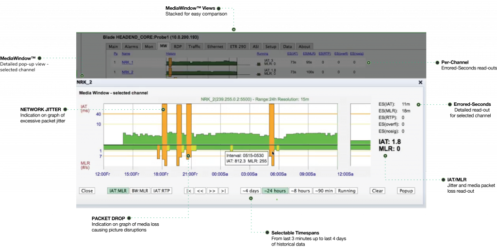
But it’s also present in our products. For many years we’ve focused on turning numerical data into visual, highly intuitive and usable information – most notably our waterfall graph, which makes it quick and clear to identify when data is falling outside of its expected parameters. Combined with automated alarming, it provides at-a-glance, actionable insight.
But what we’ve come to realise is: making data visual is just a first step. To make our probes truly versatile to all users, we need to provide flexible ways for users to choose how they engage with the data – catering both to their learning style, and the objectives they hold when they’re engaging with the data.
As a result, we’ve recently expanded the ways that we present data. For instance, we’ve re-introduced the numerical data readouts themselves alongside graphic visualisations, which allows for a more objective understanding of the values themselves, rather than their relative relational values. And alongside in-the-moment waterfalls and data readouts for immediate error recognition, we’ve incorporated general recording logs of all events, to allow for improved ‘over time’ detective work to hunt down more subtle and pervasive errors in the network. We’ve also added thumbnail views so that the ‘theory’ of the network values presented can be directly checked against the ‘reality’ of the images being broadcast.
On our VB440, we’ve pursued the visualisation of data even further – augmenting our existing and extensive list of waveform, vectorscope, diamond view and chromaticity graphs with augmented HDR visualisation of the actual images that audiences are seeing – allowing users to preview HDR even on standard definition screens. On top, we’ve added things like a pixel value selector, and a safe area preview for graphics and titles, so creatives are instantly able to see what their data is doing, without necessarily having to understand or translate numerical data into meaningful insight themselves. After all, for camera painters, there is no greater weapon in their arsenal than their eyes: whilst metrics help to contextualise what they’re seeing, real-time visualisation is crucial, and the VB440 lets them do it from anywhere in the world, with nothing more than a HTML-5 browser window.
The same goes for audio engineers. Gonio, LUFS and room meters are key tools to them – and we provide them all – but hearing the mix is the ultimate litmus test, and our ability to downmix multi-channel audio into a stereo browser output, or – as of this month – isolate and generate audio preview of individual channels in a multichannel mix, means that audio engineers can listen to broadcasts with headphones through any browser, meaning audio engineers are able to deploy their most valuable tool – their ears – even whilst on the move.
Giving context to the complex
On top of this, we’ve also placed a big focus on one of the most important components of a data set: context.
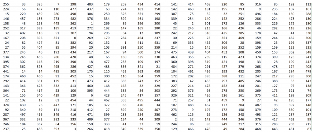
People believe that the more data you have at your fingertips, the more insight you have into an issue. But this belief misses some key points. Take a look at the chart below. That’s a lot of data. But does it give any insight? No: because it has absolutely no context: no explanation, background, labels or identification.

Even if you put it in a visual graph – you might get a little more insight, the possibility to at least identify trends and correlations. But without knowing what the data points represent, there is no real meaning to be gathered from the data. It seems simple – after all – it was drilled into us repeatedly at school: ‘always label your axis!’. But it represents a much more important truth: data is useless without context. And thus, necessarily, data is at once an objective measure of something, and at the same time a highly manipulable, subjective entity that gives meaning according to the context we give it ourselves.

This is why we think it’s important to a) give clear context to the data we’re presenting, and b) be entirely transparent about what that context is and why it matters. And we’ve done that with our latest addition: the ability to hover over any network value being displayed, and have its background explained in clear detail: what the value means, why it matters and how it is being calculated. Even better, the example given for that calculation is dynamic, constantly inputting the real-time data into the formula to show you how adjusting values are creating the moving output.
This benefits both veterans – who can be more critical about what they are seeing and why – and rookies, who can ‘learn on the job’ as kinaesthetic learners, with the dynamic hover cards allowing them to immerse themselves in the data and understand it in its direct operational context.
Bridge Technologies: Have it Your Way
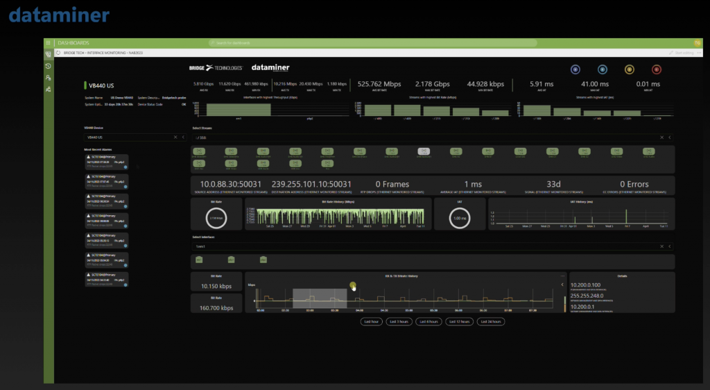
Strangely, we always thought ‘Have it Your Way’ made better sense as a slogan for Subway, not Burger King. But setting aside burgers and sandwiches, it’s us at Bridge Technologies that deserves the title most of all. Because we give you data, your way. Whether it be through the entirely customisable Remote Data Wall, through our own Widgets™, through API integration into your own systems, or through partnership with other network control providers (one brilliant example being Skyline Communications’ DataMiner) we allow you the flexibility to access data that matters to you, in a way that is meaningful and accessible to you.

So regardless of whether you’ve already learned everything there is to know about network performance and packet behaviour, or whether you are just setting out on your learning journey, you can be sure that with Bridge Technologies, regardless of your learning style, there will be nothing you don’t know about how your network is performing.


