
The principles of good UI design
There is a particular kind of announcement that appears with predictable frequency around trade show season. It announces a ‘completely redesigned user interface’ with great fanfare. Upon inspection, the redesign turns out to be a new colour scheme, some bevelled buttons, and perhaps – if the vendor is feeling particularly adventurous – a different font. This is not design. This is decoration.
Good design is not about how things look. It is about how things work. Specifically, it is about how things work with the human brain, not against it.
Internal Logic Versus Frequency of Use
Humans love to order things. From babies grouping objects by size and colour, we grow into adults who create increasingly conceptual sets and subsets. The frustration arises when an item has equal claim to two conflicting groups. With physical objects – bookshelves, for example – you have to pick one location. But digital menus offer a different possibility: you can list the same item in multiple places, depending on the logical path that brought the user there.
However, logic is not the only organising principle. Frequency of use matters too. The QWERTY keyboard is the classic example – designed for speed of relational use rather than any logical grouping (and it’s something of a revelation to discover there’s absolutely no reason for the alphabet to be in ABCD order either – it’s entirely arbitrary, and what feels ‘logical’ is in fact just engrained cultural habit).
Good UI design respects principles of both conceptual logic and practical relationship. It provides logical pathways for discovery, but it also surfaces frequently used actions where users expect to find them. The two need not be mutually exclusive.
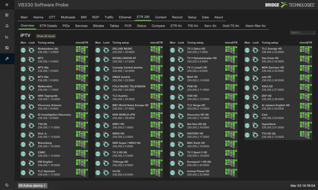
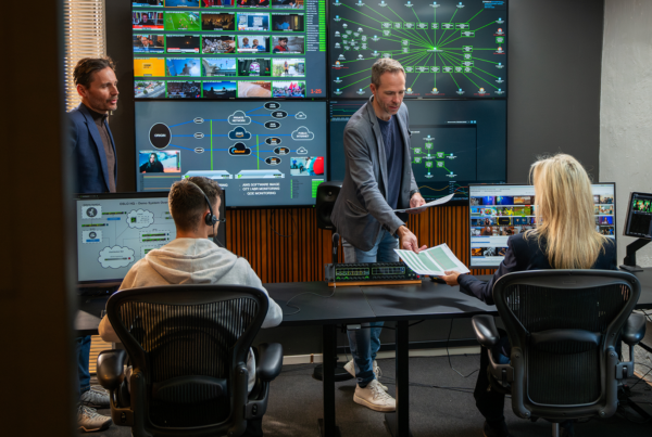
Across our compressed monitoring probes – the VB330, VB220, and VB120 – we have overhauled the menu structure. The new interface presents information in the order users need it, not the order it was programmed. Alarm thresholds can be adjusted directly from the information panel, without clicking through to a remote menu. Drill-down flows naturally from the data at hand, not from a separate navigation tree. It goes even further with the new webUI interfaces aggregating thumbnail views, the patented MediaWindow™, and microETR analysis into a single, streamlined dashboard – but they still provide the opportunity to drill down deep into the nitty gritty.
Not Breaking Flow State
There is a well-documented psychological phenomenon: walking into a room and immediately forgetting why. Researchers at UCL identified that this is not a physical effect but a cognitive one. Crossing an ‘event boundary’ – a doorway, a virtual gateway, even a new screen – causes the brain to reset the short-term memories it expects to need in the new context.
This has direct implications for UI design. The goal is to keep the user in a state of flow, where each element of a task leads naturally to the next stage without bottlenecks or roadblocks. Every time a user has to click through to a separate menu, they cross an event boundary. Every time they have to remember where a particular setting lives, they break flow. Click-throughs that bring up new menus to allow parameter adjustments rather than leaving the page completely are more like staying in the room and looking in the draw, rather than heading halfway across the house only to forget what you were doing.
Even something as simple as dark and light mode matters. When the room you are entering looks more like the room you left, the cognitive cost of transition is lower. That is not aesthetics. That is cognitive ergonomics.
Let Users Build Their Own Workflow
The third principle is the one most often overlooked: different users work differently. A camera painter needs different tools than an audio engineer. A network technician needs different data than a producer. A junior operator responding to an alert needs a different view than a senior engineer diagnosing a complex fault.
One-size-fits-all interfaces force users to adapt to the tool rather than the tool adapting to them. That is backwards.
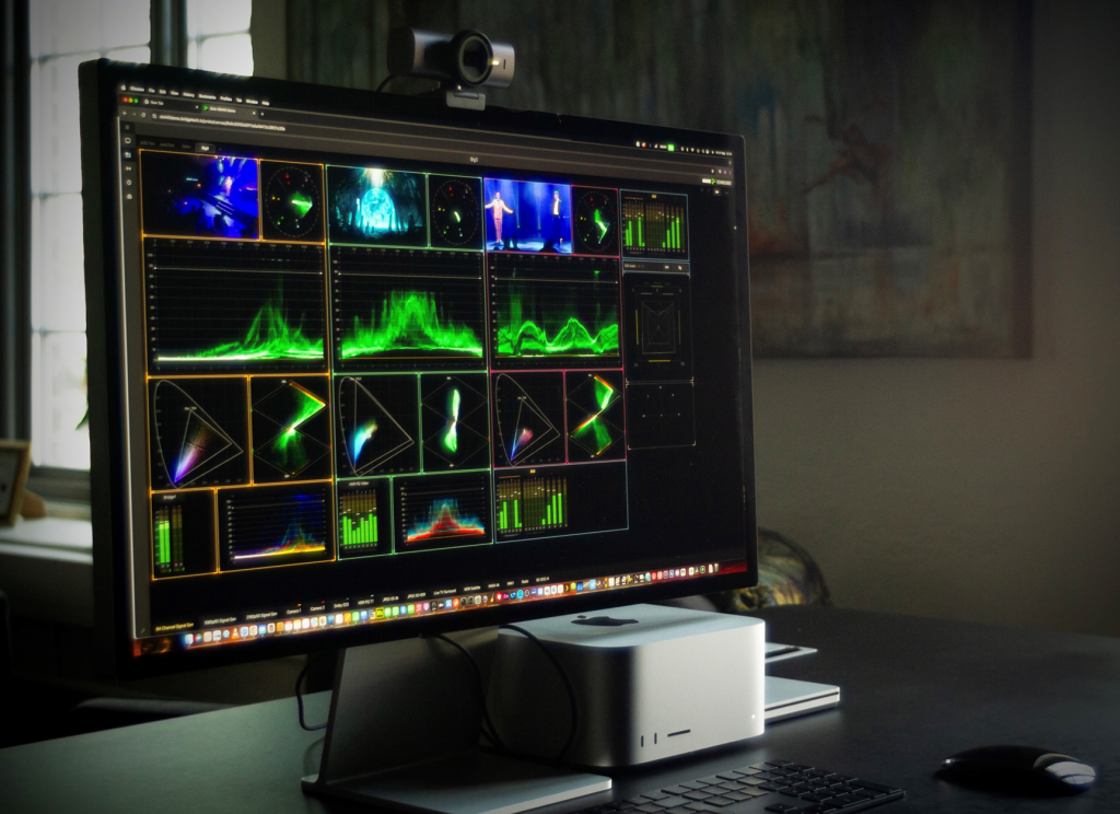
On the VB440, we have implemented what we call a canvas design. Users can place scopes, meters, and data panels anywhere on the screen, in any order, at any size, even overlaying them if that suits their workflow. That configuration can be saved to their user profile and loaded automatically the next time they log in, from any browser, anywhere in the world. One probe serves an entire production team, but each member sees the tools they need, arranged the way they prefer.
These changes did not require new hardware. They required new thinking. Good design is not about how many colours you can put on a screen. It is about how little friction you leave between the engineer and the answer. Everything else is just decoration.
Published by InBroadcast